| Location | Active Since | Avg. Yearly Sum |
|---|---|---|
| Zülpicher Straße | 2009-01 | 1553727 |
| Neumarkt | 2009-01 | 1462115 |
| Deutzer Brücke | 2009-01 | 1379376 |
| Hohenzollernbrücke | 2009-01 | 784299 |
| Bonner Straße | 2011-04 | 853279 |
| Venloer Straße | 2014-07 | 1740725 |
| A.-Silbermann-Weg | 2016-01 | 1050447 |
| Stadtwald | 2016-01 | 789168 |
| Niederländer Ufer | 2016-01 | 781918 |
| A.-Schütte-Allee | 2016-01 | 654382 |
| Vorgebirgspark | 2016-01 | 281671 |
| Vorgebirgswall | 2018-06 | 962966 |
| Universitätsstraße | 2020-04 | 1441397 |
| Rodenkirchener Brücke | 2021-01 | 603411 |
| Severinsbrücke | 2021-01 | 540510 |
| Neusser Straße | 2021-08 | 829417 |
| Hohe Pforte | 2022-01 | 1105224 |
A reliable forecast of the bicycle traffic is an important indicator for planning and optimizing the infrastructure of a city. In this post, I will predict the bicycle traffic in Cologne based on counting data from local bicycle counting stations.
This project was originally part of the course Machine Learning and Scientific Computing at TH Köln and I worked on it in collaboration with my friend and collegue Felix Otte. While Felix supervised the model trainings and the evaluation of the models, I was responsible for data cleaning, exploration, and visualization. For this writeup, I performed re-runs of the original trainings and added a new class-based implementation of the whole pipeline that is closer to something useful in production. As a newly added feature, I also included an implementation of prediction intervals using the mapie library.
This projects showcases the following skills:
- Understanding data sets and their issues
- Achieving data consistency through cleaning and transformation
- Applying appropriate data packages
- Getting most of the data with feature engineering
- Incorporating other available sources with scraping and geocoding
- Efficient optimizazion of hyperparameters with Optuna
- Handling multiple models with OOP in Python
- Visualization of results.
This post is reproducible. Just follow along and execute the code chunks locally.
Introduction
To make cycling in a bigger city more attractive and safe, the infrastructure has to keep up with the demand of it’s users. The city of Cologne has installed several bicycle counting stations to monitor the traffic. The data is available on the open data portal of the city. As a former bike messenger, I directly sympathized with this data set and found it fun to work with. However, the data quality is not perfect and the data is not consistent across the different stations. So we have to be a bit careful at times.
This project showcases forecasting future bicycle demands by using an XGBoost machine learning model that is trained on the timeseries of former counts as well as weather data. We will train specific models, that are specialized on predicting the counts for a single location as well as fallback/baseline versions, that can be used to predict demands in new locations. With this technique we can hopefully make accurate predictions for both longer existing stations as well as new ones, that are opened at the time of the prediction.
Data Loading
Package-wise we will use polars and pandas for data manipulation, optuna for hyperparameter optimization, and sklearn/XGBoost for the machine learning part. Let’s also define a function, that downloads the bicycle counting data from the open data portal of the city of Cologne. As the tables are not really consistent, we need to take care of the following cleaning steps:
- Ensure the German is correctly encoded. We have to rename them, because the encoding is not consistent.
- Replace the month names with integers to make conversion to
pl.Dateeasier. - Extract the year from the file name and add it as a column.
- Convert year and month to a
pl.Datecolumn. - Remove rows that include yearly sums.
- Remove columns that have too few data points.
- Unpivot the data to have a long format.
- Cast the count column to
pl.Int64. - Drop rows with missing values. Some files even have blank rows in between.
We can use this in a list comprehension to download and concatenate all .csv files from the portal. The links are stored in a text file. So we will read it’s lines first. The second part includes some feature engineering, that might get moved later on.
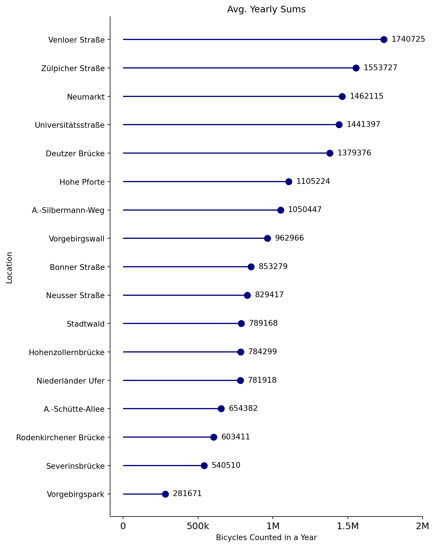
Let’s have a look at the start dates of each location as well as the average yearly sums of bicycle counted at each location.
Spotlight “Zülpicher Straße”
Zülpicher Straße is one of the first locations equipped with a counter, and counts the second most bicycles evcery year. We will plot the data with plotly to make it interactive. A trendline helps understand the general development of the counts.
Draw Locations on a Map
Scrape the Geolocation Data
In order to draw the counting stations on a map, we need their locations. Since open data Cologne does not provide this information, we will use the geopy library to scrape the data from OpenStreetMap—specifically, we use the Nominatim geocoder. We will store the data in a dictionary and convert it to a pd.DataFrame for better handling. The call geolocator.geocode(loc + ", Köln, Germany") makes a request to the Nominatim API and returns the location of the adress. So this is only approximate, as the exact counter location may differ from the address.
Plotting
Now let’s put everything together and make an interactive plot. We will use plotly to create a scattermapbox plot and a slider to switch between the dates.
Incorporating Weather Features
We will scrape the weather data from the web and extract the files necessary. The data is then loaded into a pl.DataFrame and cleaned. We mainly do some renaming and type casting. Lastly, we deselect some columns that are not needed.
| date | sky_cov | air_temp_daymean_month_mean | air_temp_daymax_month_mean | air_temp_daymin_month_mean | air_temp_daymax_month_max | air_temp_daymin_month_min | wind_speed_month_mean | wind_speed_daymax_month_max | sunshine_duration | precipitation_month_sum | precipitation_daymax_month_max |
|---|---|---|---|---|---|---|---|---|---|---|---|
| 2004-08-01 | 5.14 | 19.26 | 25.01 | 14.42 | 2.45 | 32.5 | 18.1 | 8.5 | 198.8 | 128.8 | 38.3 |
| 1980-08-01 | 5.48 | 17.84 | 22.75 | 13.15 | 2.37 | 31.2 | 16.5 | 5.3 | 161.2 | 125.2 | 47.4 |
| 1963-06-01 | 5.52 | 16.55 | 21.53 | 11.12 | 2.21 | 26.5 | -999.0 | 7.0 | 178.4 | 84.3 | 17.7 |
| 1996-03-01 | 5.17 | 3.49 | 8.37 | -0.75 | 2.17 | 15.7 | 12.9 | -10.2 | 132.4 | 20.1 | 3.9 |
| 1979-05-01 | 5.09 | 12.8 | 18.35 | 7.09 | 2.26 | 30.9 | 25.0 | -2.9 | 206.2 | 75.7 | 15.7 |
| 2017-04-01 | 4.93 | 8.47 | 14.07 | 1.78 | 2.43 | 23.6 | 15.8 | -4.3 | 164.3 | 16.7 | 8.3 |
| 1994-04-01 | 5.24 | 9.05 | 14.55 | 4.25 | 2.35 | 25.2 | 28.8 | -2.6 | 145.5 | 25.9 | 6.6 |
| 2005-09-01 | 4.09 | 16.14 | 21.95 | 10.67 | 2.03 | 29.4 | 14.0 | 2.0 | 203.2 | 58.9 | 16.5 |
| 2018-05-01 | 4.18 | 16.9 | 23.42 | 9.08 | 2.32 | 30.6 | 15.6 | 0.6 | 273.5 | 56.2 | 17.6 |
| 1964-03-01 | 5.62 | 3.26 | 7.45 | -0.34 | 2.55 | 14.5 | -999.0 | -9.2 | 112.0 | 51.1 | 19.3 |
Merging the Data
We merge the weather data with the bicycle counts. We will use a left join, because we want to keep all the bicycle counts. In a second step, we will split the data into a training and a test set. The data from year 2022 will be used for testing, only. We can split the data by filtering the date column.
Machine Learning
Next up is the fun part: Actual Machine Learning! In this project, we will use the XGBoost regression model. We will use Optuna to sample hyperparameters and cross-validate them with the TimeSeriesSplit.
Feature Engineering
Let’s define some sklearn transformers to perform feature engineering. We will create a ColumnTransformer that will be used in a Pipeline.
Tuning objective
Next we will define a custom objective function, that we want to minimize. The function will be called by Optuna and will return the negative RMSE of the cross-validated model. We will use the XGBRegressor from XGBoost as the model and the transformer as shown in the code block above.
The Predictor Class
In order to fit and predict for multiple counter locations, we will have to write a bit of custom OOP code. Due to the data structure, we want to map special models which are specialized on predicing the bicycle counts for a single location to their data. We will define a class SimpleModel that will hold the models. The class will have methods for tuning, refitting, and predicting. “Simple” refers to the fact that we are predicting single values. We can inherit from this class to extend it with prediction intervals later on.
As all necessary boilerplate code is already written in the BicyclePredictor class, we can now use it with very little code.
Evaluation
Finally, we can evaluate the tuned pipeline of transformers and models on the evaluation data of the yet unseen year 2022.
| Metrics on Holdout Data | ||||
|---|---|---|---|---|
| Location | Avg. Monthly Count | RMSE | MAPE | baseline |
| Neumarkt | 126157 | 11469 | 0.08 | false |
| Vorgebirgswall | 92718 | 11920 | 0.09 | false |
| Hohenzollernbrücke | 73095 | 11204 | 0.1 | false |
| Hohe Pforte | 92102 | 11028 | 0.1 | true |
| Venloer Straße | 167610 | 23240 | 0.11 | false |
| A.-Silbermann-Weg | 83481 | 10751 | 0.11 | false |
| Niederländer Ufer | 72004 | 9990 | 0.11 | false |
| Zülpicher Straße | 148239 | 26699 | 0.15 | false |
| Stadtwald | 74314 | 15191 | 0.16 | false |
| Neusser Straße | 98155 | 18376 | 0.17 | false |
| Deutzer Brücke | 142528 | 35616 | 0.19 | false |
| Bonner Straße | 79392 | 18527 | 0.19 | false |
| Severinsbrücke | 48116 | 12039 | 0.22 | false |
| Universitätsstraße | 133047 | 35229 | 0.23 | false |
| Vorgebirgspark | 31012 | 10887 | 0.25 | false |
| A.-Schütte-Allee | 61827 | 19031 | 0.3 | false |
| Rodenkirchener Brücke | 52069 | 18055 | 0.37 | false |
Plot the Predictions vs Actual Counts
First, let’s start with some location that did really bad:
While our model for Severinsbrücke seems to show the seasonal pattern, it is not able to predict the peaks with the correct magnitude. The model for Bonner Straße is not able to capture the trend at all. Let’s have a look at the best location, on the other hand:
Extension: Prediction Intervals
To quantify the uncertainty in our predictions, we can use conformal prediction intervals. As a formal definition for general regression problems let’s assume that our training data \((X,Y)=[(x_1,y_1),\dots,(x_n,y_n)]\) is drawn i.i.d. from an unknown \(P_{X,Y}\).Then the regression task is defined by \(Y=\mu(X)+\epsilon\) with our model \(\mu\) and the residuals \(\epsilon_i ~ P_{Y|X}\). We can define a nominal coverage level for the prediction intervals \(1-\alpha\). So we want to get an interval \(\hat{C}_{n,a}\) for each new prediction on the unseen feature vector \(X_{n+1}\) such that $\(P[Y_{n+1}\in \hat{C}_{n,a}(X_{n+1})]\ge 1-\alpha\) . We will use the MAPIE package to get performance intervals that are model agnostic. This is great, because we can plug in our existing pipeline and get the intervals with just a bit of wrapping. Now, there are different approaches to constructing prediction intervals. But since we are dealing with a timeseries, that violates the i.i.d assumption, we need to use ensemble batch prediction intervals (EnbPI). Read more about that here.
We will define a new class QuantileModels that inherits from BicyclePredictor and extends it with the necessary methods to fit the MapieTimeSeriesRegressorand predict the intervals. We will use the BlockBootstrap method to resample the data and get the intervals. We will also define a method to plot the intervals.
This code combines some of the examples here and here.
Now, we can instantiate the MAPIE model and set some necessary attributes. We are basically transferring some optimization results to the new instance to not tune the models again. Instead, we are just fitting the underlying MAPIE time series models.
Now let’s plot our new prediction intervals and their mean predictions for the location “Venloer Straße” for the test year 2022.
The model is fairly uncertain, what the lower bound of bicycles counted is in the unseen time range. The upper bound at least includes all the actual counts. This is a good sign, but the model might be too conservative.
Extension for Real-Time Predictions
An extension to this project allowing real-time predictions is described in this follow-up post. Here, I’ll use the Flask library to create a REST API that makes predictions using our pickled models. We will also use real-time weather data from the tomorrow.io API to get a inference feature vector.