Visualizing abstract data helps get an intuitive feel for the raw data that sometimes goes beyond summary statistics. In this post, I show how to visualize the Düsseldorf soundscape data set using Bokeh. Explore the app here!

This project was part of the Data Visialization course at Technische Hochschule Köln. The goal was to create an interactive visualization of the soundscape data set, that I helped collect during my time as a student research assistant at Hochschule Düsseldorf.
Data Set
The data set is published on Zenodo. It contains 6000+ soundscape rating from 100+ participants. The participants were asked to record and rate their soundscapes inside their private dwellings. Ther recordings are encoded to time-series of acoustic features and spectrograms to ensure privacy. However, the ratings, personal information, and situational context are included in the data set, which makes it a rich source for acoustic research.
Bokeh App
You can access the interactive app at the Posit Cloud. It allows you to explore the data set on an individual level.
The challenge with this app was, that I wanted to allow browsing through participants. We have to update the plots quickly, so we have to run a Bokeh server in the background. This makes deployment a bit more complicated, but the Posit Connect Cloud makes it easy to deploy Bokeh apps directly from the GitHub repository.
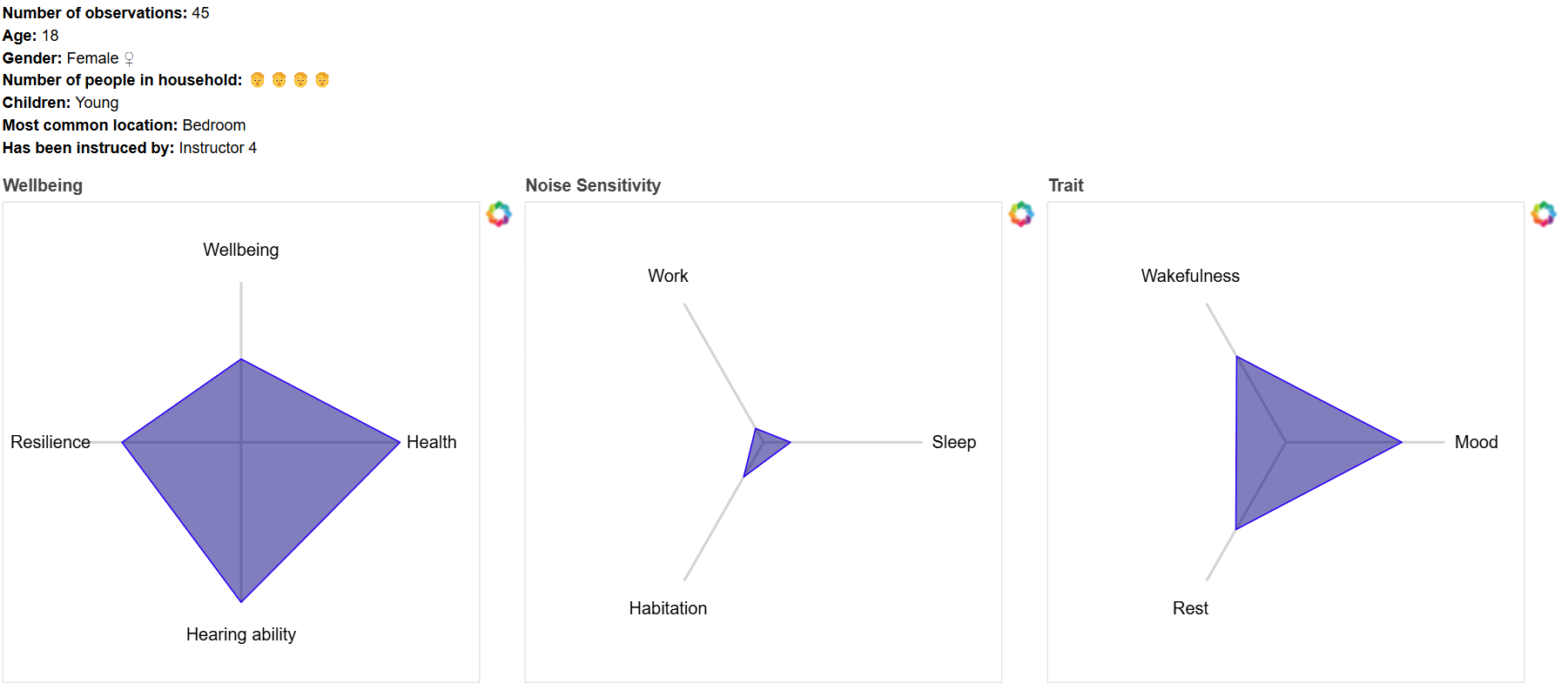
First, I wanted to find a way to visualize the different personalities. I used a cluster of radar charts to show the personal factors in three fields: wellbeing, noise sensitivity, and trait. You can see an example of this at the top of this blog post.
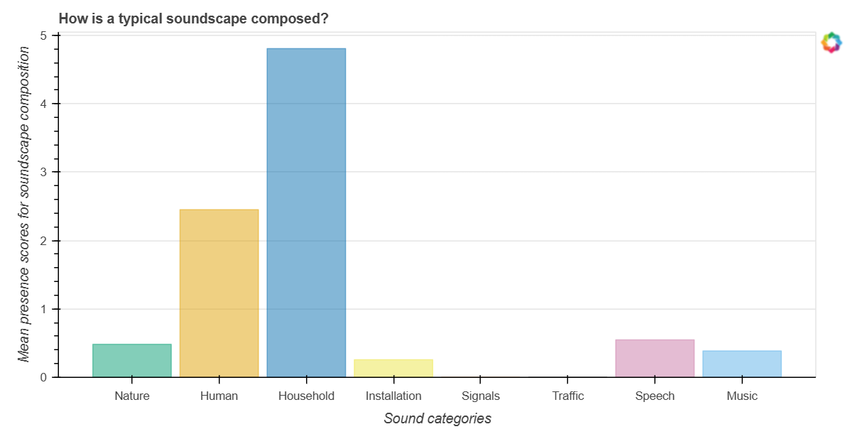
Secondly, person related meta data is visualized for example in the following bar plot to show composition of soundscape categories.

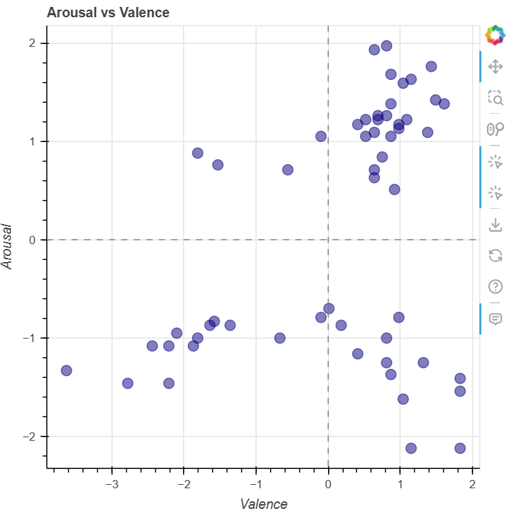
The other part of the app visualizes the soundscape ratings directly as scatter plots. In the following example, we plot the ratings of personal valence against the ratings of personal arousal.

This participant rated themself as either very aroused or very calm, but never in between. On the other hand, the valence ratings are more evenly distributed. Also, we can see a cluster of points in the top right corner, which indicates that the participant rated themself as very aroused and very happy at the same time.
Project Report
The full project report is published at researchgate.net.