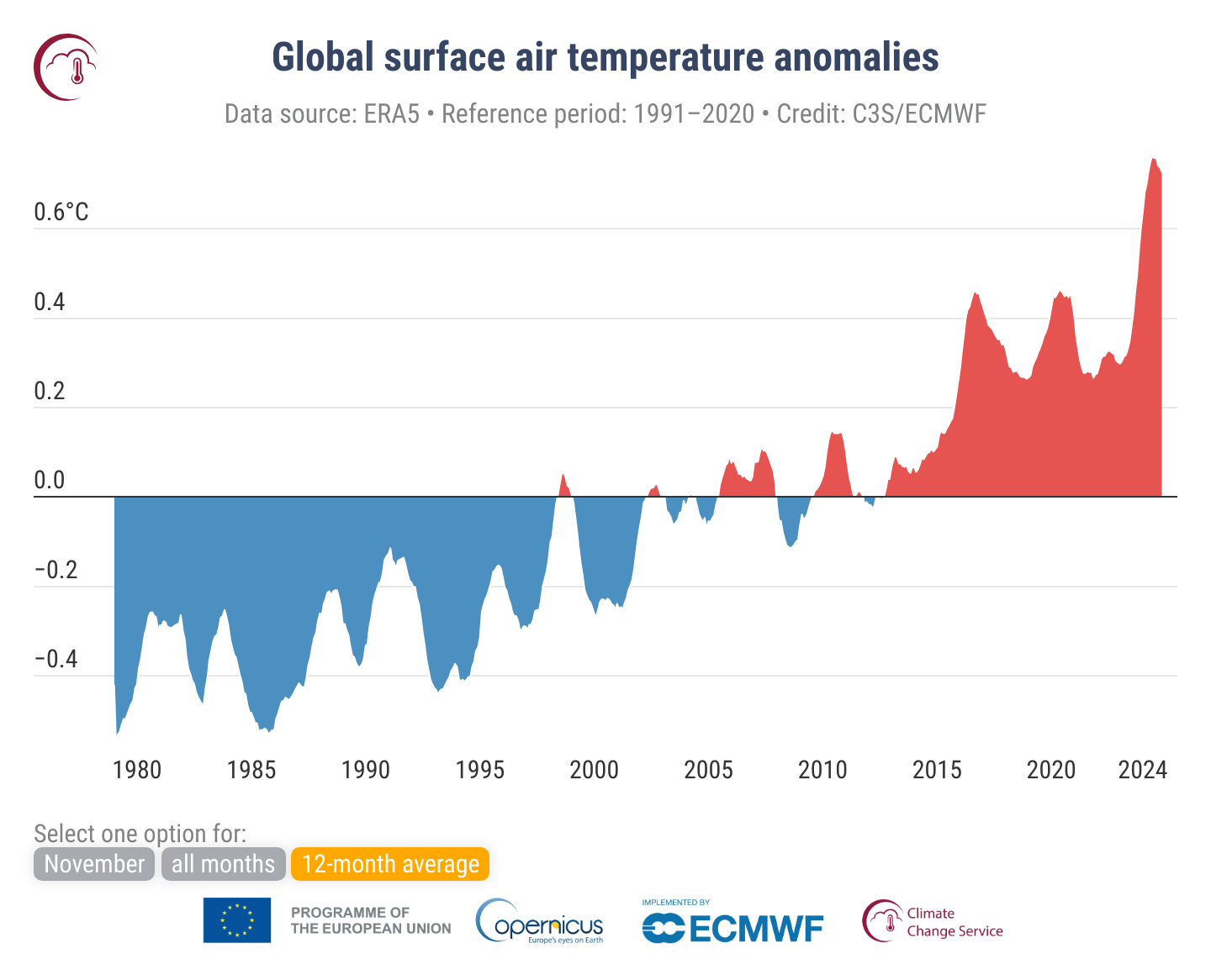
2024 will most likely be the first year to exceed 1.5°C above the pre-industrial average. To get a better understanding of the local temperature development, I decided to recreate a chart that shows the air temperature anomalies relative to a more recent period: 1991–2020. The chart that we will recreate is published by Copernicus Climate Change Sercive (C3S) here and looks like this:

The reference period for the pre-industrial age is typically 1850–1900. More information on this topic is available at C3S or in this post by Eli Wizevich.
The chosen C3S plot shows the deviation of the moving 12 months average temperature to the average temperature in the reference period 1991-2020. It uses a filled area plot with blue and red indicating averages below and above the reference temperature, respectively. The plot is themed minimalistic with a white background and only horizontal gridlines.
So to recreate this for the town I live in, we need to:
- get the coordinates of the city of Wuppertal,
- use the coordinates to download the historical temperature data,
- aggregate using a rolling mean,
- calculate the reference temperature,
- plot everything.
General information on Wuppertal
Before we dive into the code, here’s some information on Wuppertal: It’s is a town in the region Bergisches Land and is following the river Wupper. It is well known for its steep hills and the famous Schwebebahn, a suspension railway. The town is located in the state of North Rhine-Westphalia in Germany. A paper from Bergische Universität Wuppertal (2015) goes a bit into detail what makes the climate in Wuppertal special:
At the heights of the Bergisches Land region, moist Atlantic air masses meet an obstacle for the first time with the prevailing westerly air currents and are dammed up. As a result, the clouds rise into higher layers of air, which are usually colder, condense and rain down in the form of downpours. Around 1100 mm of precipitation is recorded in Elberfeld, rising to 1200 mm in Barmen/Oberbarmen.
Packages
For getting the temperature data we’ll be using the meteostat package. The data wrangling can be performed in polars and we’ll use plotly to make interactive plots afterwards.
Get the data
We could get coordinates from the geopy package. In this case, for a single request, I found it quicker to just google it. We pass the coordinates to the Point class and then use it inside Daily to define the timespan for this location and the data frequency. For a quick overview we can just plot the data with the plot method.
In this post I simply load the pre-fetched data from a csv file, because I could not resolve a dependency conflict with the meteostat package in the context of my environment used for the website.
Data wrangling
Next we move over to polars to do the data wrangling. We can throw away the time information and make a date column. Afterwards, we can apply our rolling average with a 12 month or 365 days window.
To not get totally confused, I did the reference calculations not in a chain but simply created a new object by subsetting the dataframe to the relevant time points. We also calculate the yearly average deviation to plot bars for each year. In the final assignment in this chunk, we split up the data into two columns, one for the positive deviations and one for the negative deviations. This makes it easier to plot different colors for the two cases.
Plotting
Now comes the easy part. We just add two traces of go.Scatter to a go.Figure object. We could also add the yearly average deviation as bars. I decided to make this optional. You can click on the legend elements to view the bar plot. The update_yaxes method is used to add the °C to the y-axis ticks. In order to get a similar theme as in the original chart, we will use the “plotly_white” template and remove the horizontal gridlines with the update_xaxes method.
Some notes
Compared to the global data from the ERA5 reanalysis, Wuppertal shows longer periods of above-reference temperatures in the 2000s. This seems to be a bit earlier than the global average. However, the global chart shows high increase of temperature deviation from 2010 onwards, whereas Wuppertal saw a colder phase until around 2015. Spikes closing on 1.5°C were already noticeable in June 2007 and April 2019. March 2024 (corresponding to a 12 month moving average) was the first time point in the data at hand to exceed 1.5°C above the 1991-2020 average. While the 1980s were down to 2°C colder as the reference period, the colder as reference periods get slightly warmer over time (compare 1986, 1997, 2006, 2013).